Project Background
Product history
Since launching in December of 2013, TodayTix has become a formidable player in online theater ticketing. By streamlining the ticket buying experience, TodayTix has amassed a loyal and expanding customer base. The consumer app recently underwent a design overhaul. Now in 2018, TodayTix is taking an in-depth look at their internal and partner-facing product. My three-person research team was brought in to conduct a research sprint to explore and uncover areas of opportunity for a redesign.

The TodayTix consumer app☝includes 30-day advanced purchase, daily lotteries, rush ticketing, and more. The internal-facing system struggles to keep up with these increasingly complex ticketing features. As a result, employees rely on a combination of manual processes and unintegrated digital products to complete basic operational tasks.
Context: Broadway does not like change.
TodayTix has built partnerships with over 450 theater institutions globally. Most of these partners directly allocate show tickets through an API. Not so on Broadway. Broadway theater owners, who often control ticketing, are notoriously resistant to change and innovation. The century-old institution's reticence to embrace technology combined with the prevalence of exclusive ticketing contracts has resulted in a quirky and complicated New York-only workaround where TodayTix couriers buy tickets in person at the box office before hand-delivering them outside the theater. This ambitious workaround adds countless levels of complexity to TodayTix’s internal-facing and partner-facing CMS, a custom built system that manages both inventory (tickets) as well as daily operations across multiple departments.
The Challenge
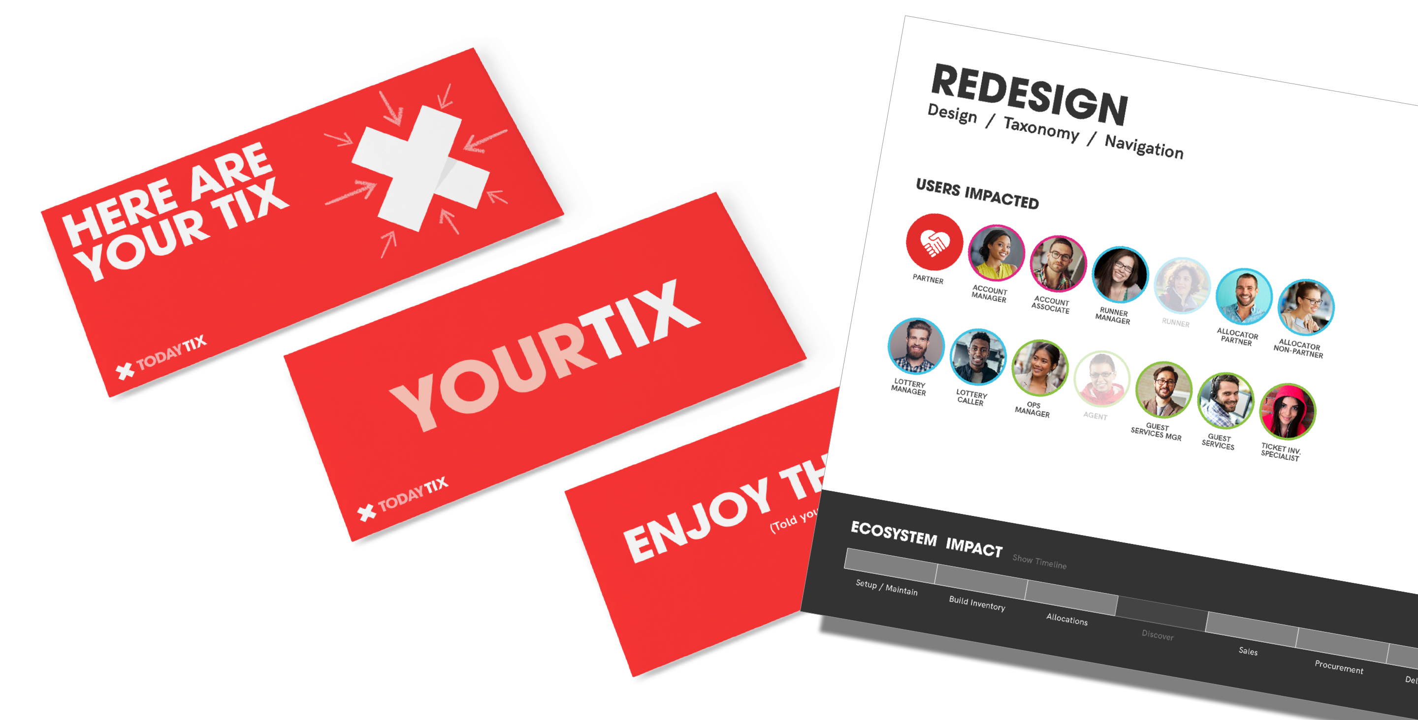
Initially developed to serve a very narrow scope of work, CMS has grown exponentially over the past four years to fit the needs of a diverse set of users with a diverse set of needs. Iterations have been focused on solving isolated problems; consequently, the platform lacks focus and cohesion from a UX and technical perspective.
How might we approach a redesign of the CMS that will improve effectiveness of core operational functions with a focus on scalability and flexibility?
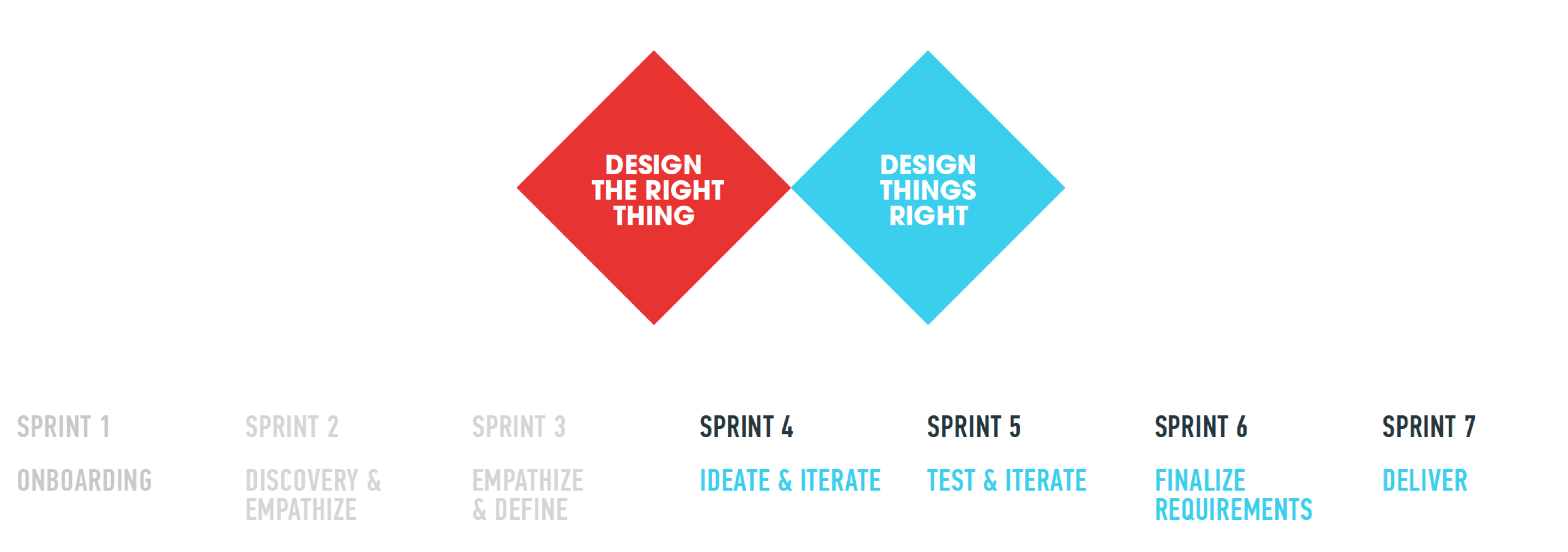
Discover
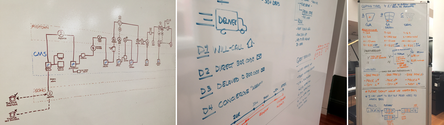
The process of listing, selling and delivering a theater ticket is complex. Diagrams helped us wrap our heads around the process.
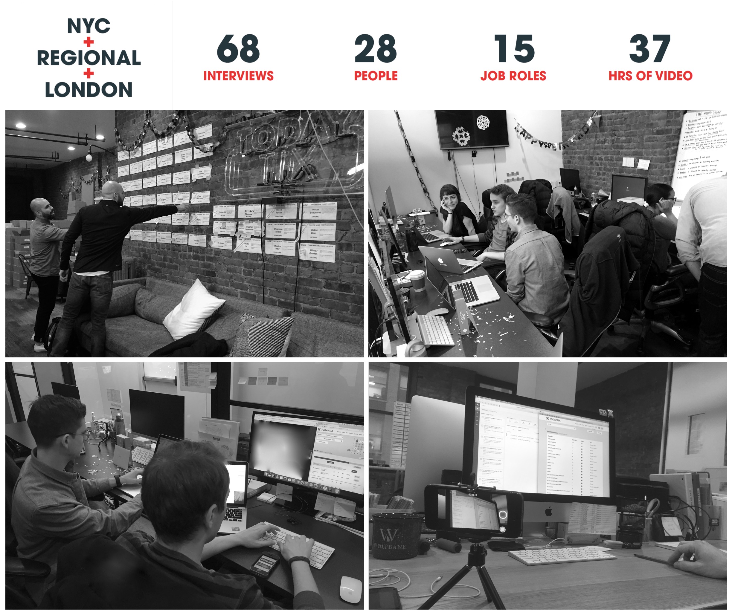
Once we had a sufficient grasp on how a theater ticket finds its way to a TodayTix user, we jumped into a two-week contextual inquiry. We got to know product users across the company, from accounts managers to the couriers who hand deliver tickets to customers.
What we learned: Operations vs. Accounts
Midtown Operations exclusively handles Broadway and Off-Broadway ticketing. This team makes sure that everyone who orders a ticket on TodayTix, gets that ticket. During our contextual inquiry, we encountered an incredibly complex system with many moving parts. The employees that handle allocations are highly trained multitaskers who rely on a slew of digital and analog methods to maintain up-to-date ticket inventory on CMS.
SOHO headquarters houses the other key users of CMS, the Accounts team. Account managers and associates work directly with partners (theater owners and productions) to sell a portion of their tickets on TodayTix. Because CMS is both limited in scope and difficult to use, they too rely on a mix of tools and methods to complete daily tasks.
These workarounds not only create a frustrating user experience, but they affect overall productivity. As the company plans for continued expansion both domestically and internationally, the redesign must address needs across multiple user groups.
Define
Challenging assumptions
Our initial hunch was that additional CMS functionality would greatly optimize the workflow of the Operations team. Research indicated otherwise. Under the current constraints, workarounds and multi-channel communication (email, Google Sheets, iMessage) would likely remain mostly intact.
As we became more familiar with CMS, opportunities started to cluster around the Accounts department. Redesigning various account-related tasks, such as setting up a new show on the platform, would greatly improve user experience for the Accounts team as well as partners who use CMS via the partner portal.
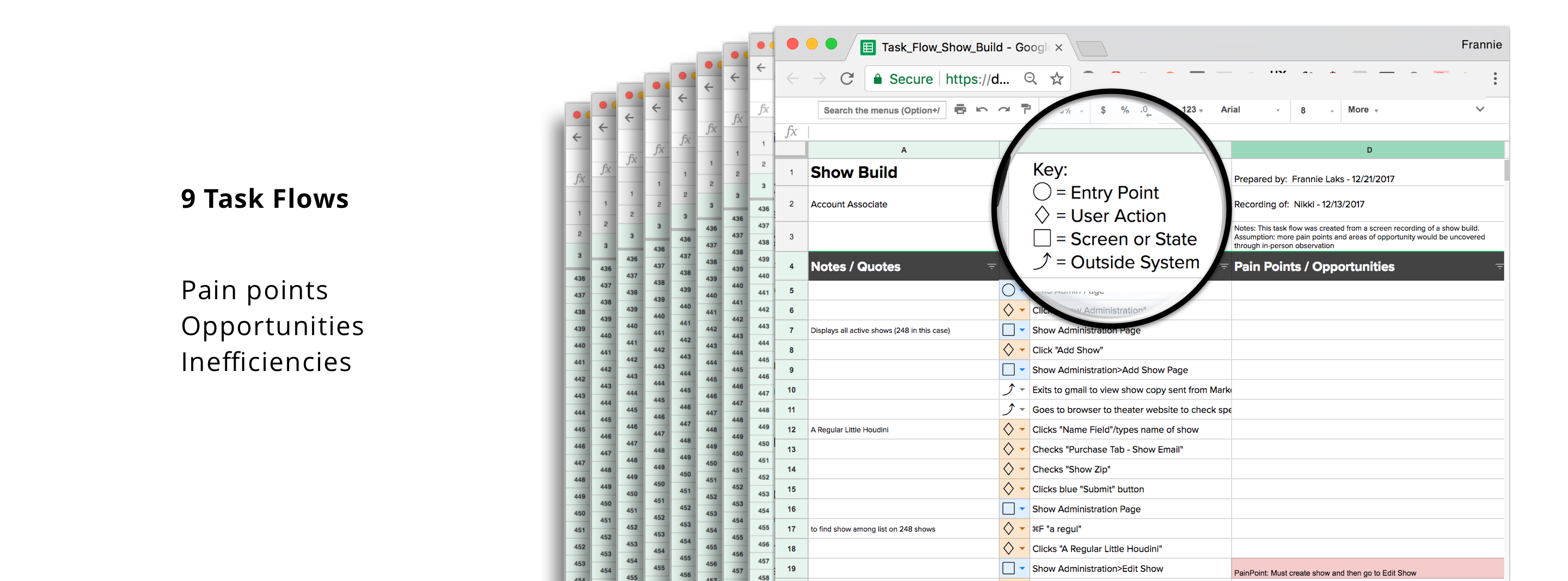
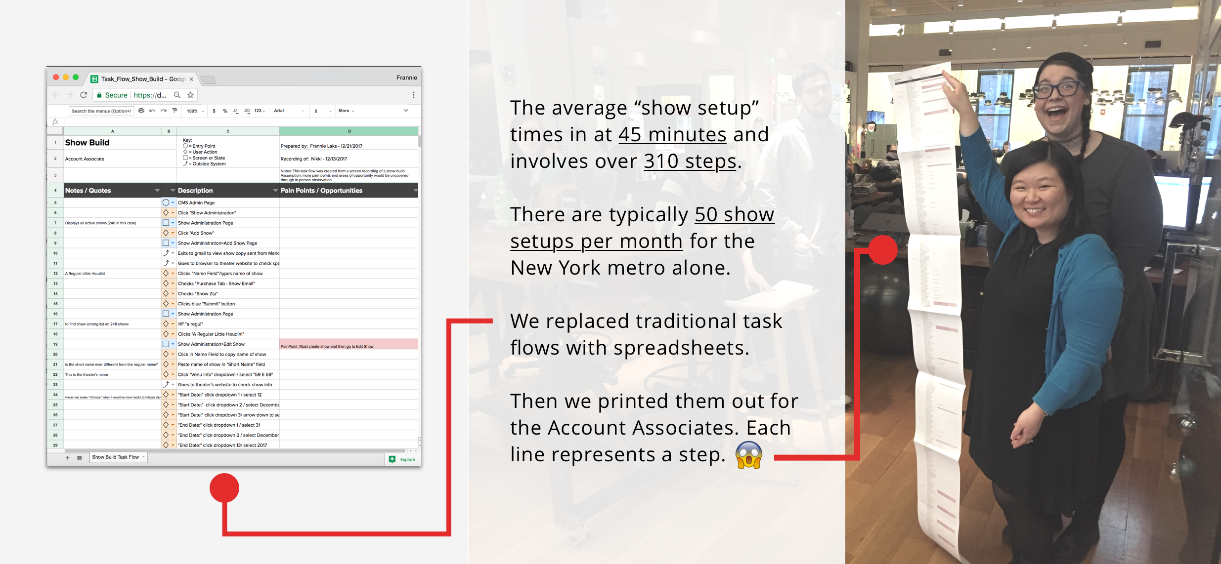
Dissecting a task
What does setting up a new show on the TodayTix platform look like? It looks like 45 minutes and 310 steps! We quickly realized that a traditional task flow diagram would not work for our purposes and reenvisioned the task flow in spreadsheet format. This format allowed us to quickly identify inefficiencies, potential areas of opportunity along the way. We noted all workarounds and when the user left CMS to reference another application, which happened 15 times during the show setup (Show Build) task.👇
Who are we designing for?
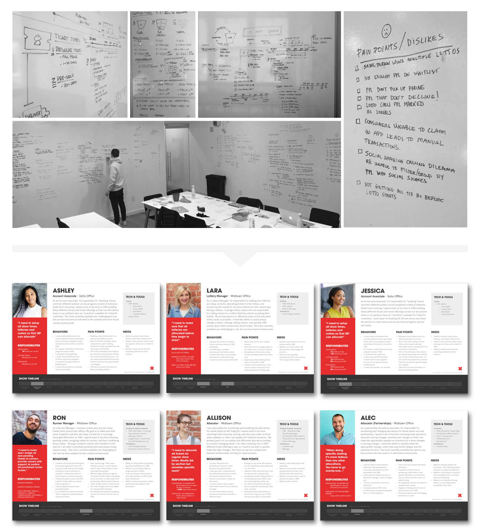
We really got to know the people who use CMS on a daily basis and had a strong understanding of their workflow and digital interactions, so empathizing with them came easily. But we needed to ensure that we properly communicated and transferred this empathy to stakeholders, developers and future product designers. Distilling the vast amount of data we gathered into concise, top-level personas was a challenge. We used large swathes of whiteboard to make sense of our research findings. Because the needs and interactions were so complex, we created a “Show Lifecycle” diagram that visualized users’ needs, goals and actions from the moment a theater partners with TodayTix to when an Account Associate hits send on an end-of-day sales report.
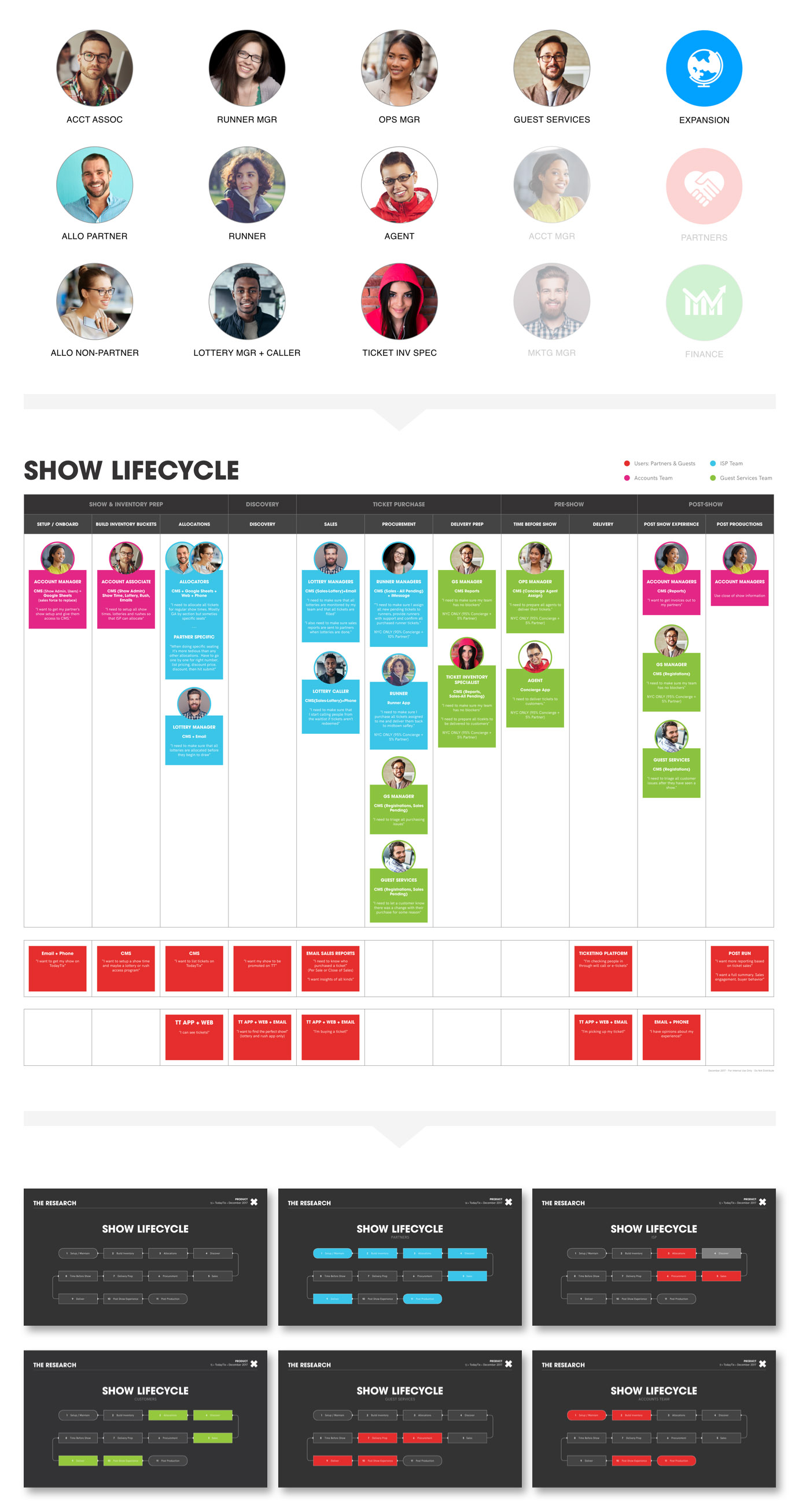
Insights gained from synthesizing our research served as the foundation for six user personas; each persona represented a CMS user group.
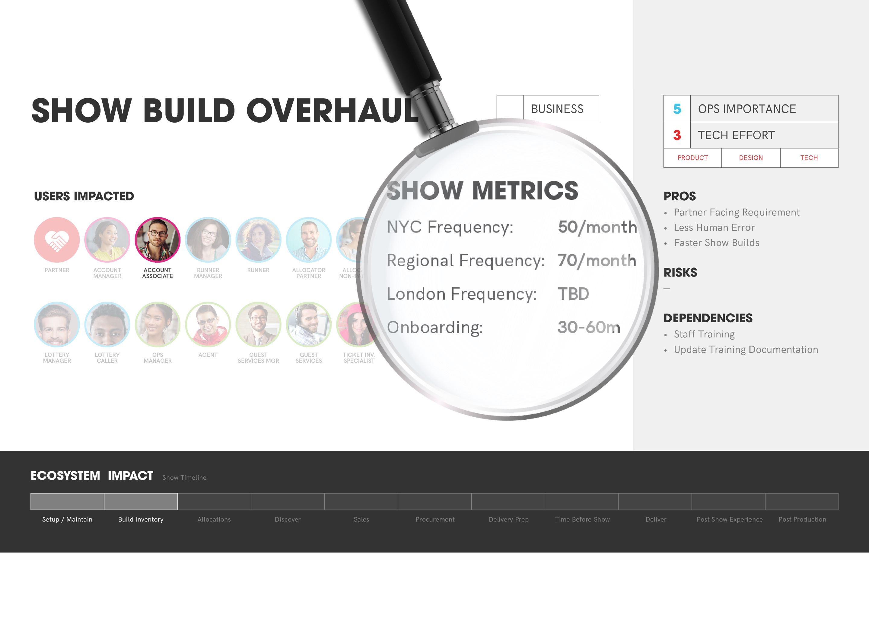
Opportunity analysis
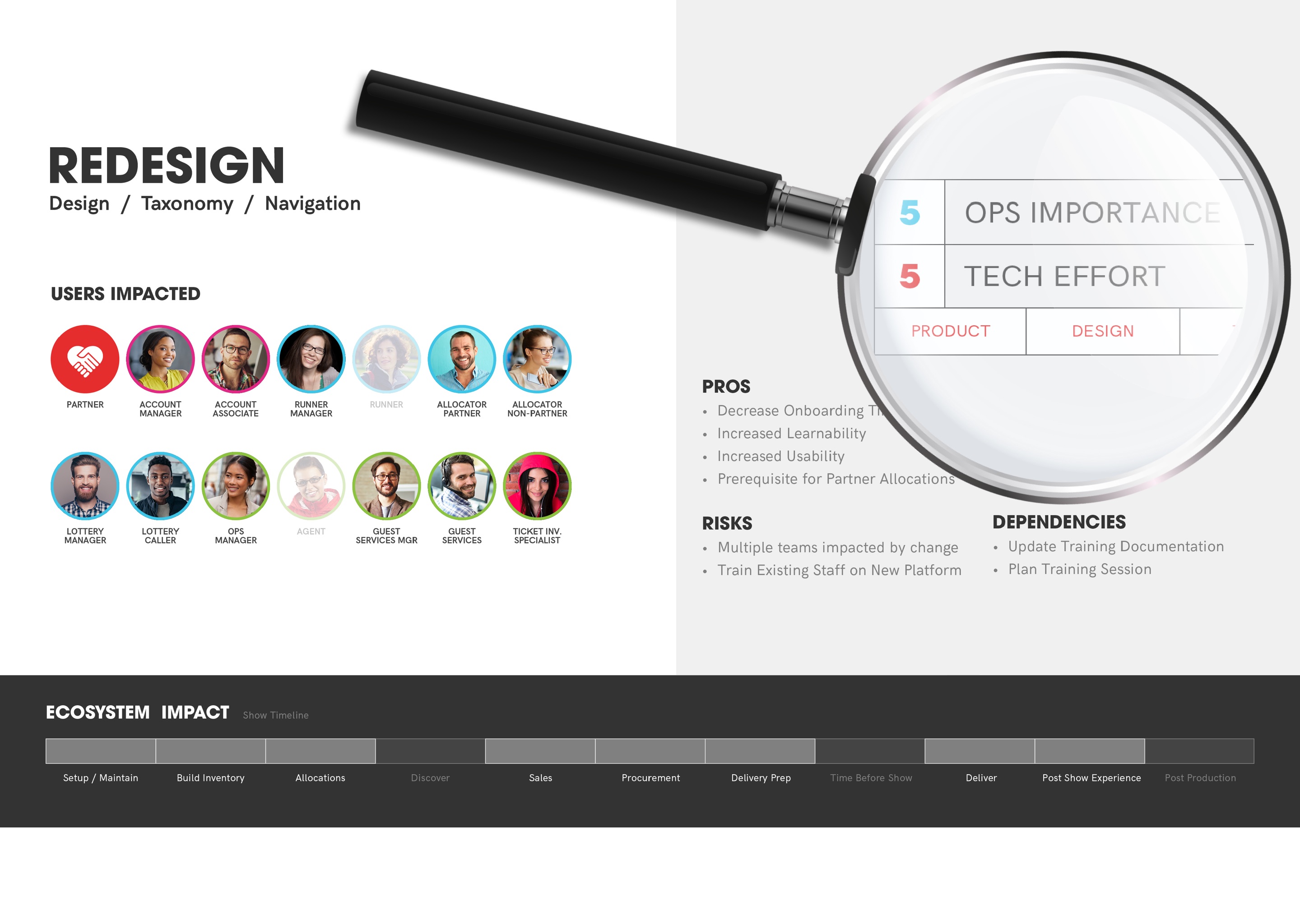
With personas in hand, we started sifting and sorting through potential areas of opportunity. But which areas of opportunity should TodayTix pursue? To figure this out, we analyzed 16 areas of opportunity and placed them in context of operational importance and technical effort. We showed how and where each area would affect CMS users. Risks and dependencies were identified alongside benefits and baseline metrics.
What’s next?
TodayTix's product team will use our research to flesh out a product roadmap for the CMS redesign. The MVP will focus on solving the most critical problems identified.
Deliverables:
• Audio/video/written documentation
• User personas & journeys
• Task flows
• Baseline metrics