Case Study:
Birdie Redesign
A platform that utilizes your social network to recommend great restaurants
Project Goal: Website Redesign
Platform: Responsive Web
My role: UX Researcher & Designer
Design Team: 4 UX Designers
Duration: 21 days
Overview
What's Birdie?
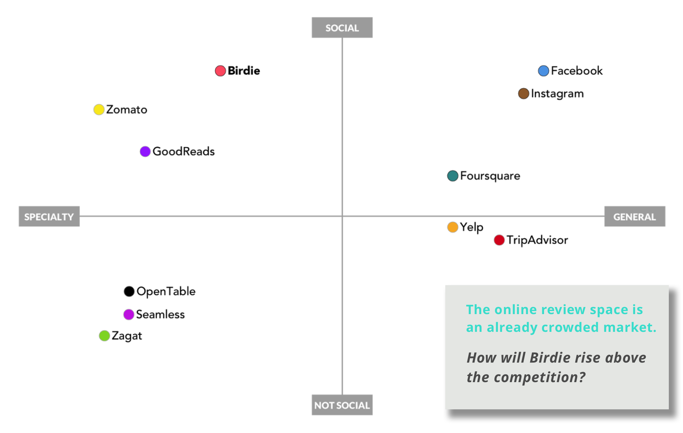
Birdie is search and discovery tool to find great restaurants through your trusted network. Unlike crowdsourced platforms that rely on content from strangers, like Yelp, TripAdvisor, and Foursquare, Birdie’s content originates from your networked connections.
And what's the problem?
Initially built as a native iPhone app, Birdie was rebuilt in early 2017 as a desktop optimized site. Since the website launch, Birdie has not grown as hoped. New users are not joining the platform and existing users are not engaged.
The challenge
Birdie lives in an incredibly crowded space. Looming in the background (as our client candidly described) lies a graveyard of failed recommendation platforms. Our four-person UX team was tasked with redesigning the website to showcase and capitalize on Birdie’s value — utilizing your trusted network to find great restaurants.

The other challenge
Our client had a very specific concept of the primary user and use case. The persona we inherited at the start of the project showed a professional woman in her mid-to-late 20s with expendable income whose primary need was expediency. During her lunch break, she would quickly jump on Birdie from her computer to find a hip spot to meet up with friends after the work day. These early assumptions about users greatly impacted the design of Birdie 1.0. To make Birdie 2.0 a successful product, we needed to revise the original persona, but more importantly, we needed to get on the same page as our client. To do this, we would ask our data-backed personas to speak for themselves.
Discover
To understand current and potential Birdie users and find opportunities to differentiate Birdie from other recommendation platforms, we started where every project should start — with research. We tackled three key areas.
1. Usability
2. Competitive Research
3. User Research
Usability Findings
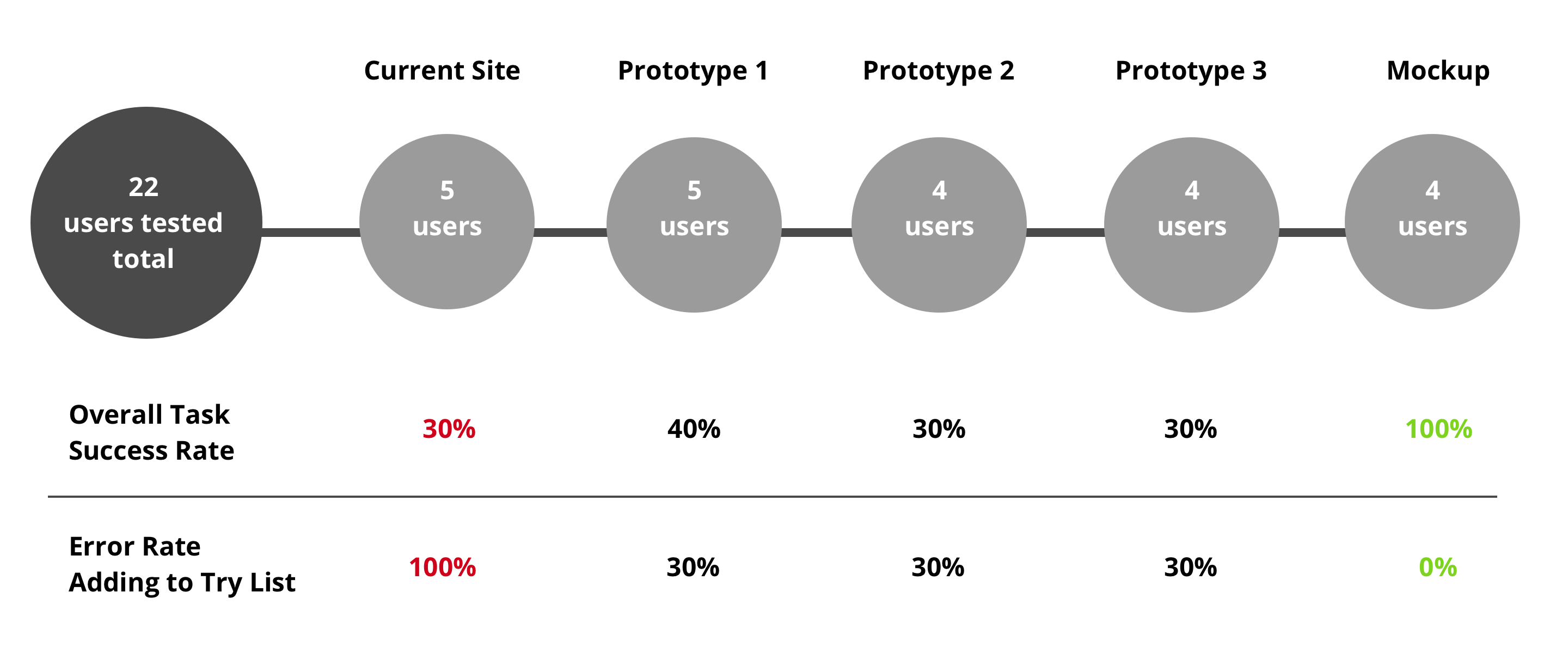
Usability tests revealed major problems with both the interface design and feature utility. Users found the some terminology unclear and confusing. Most notably, there was a 100% error rate for finding a restaurant and adding it to a To-Try List.
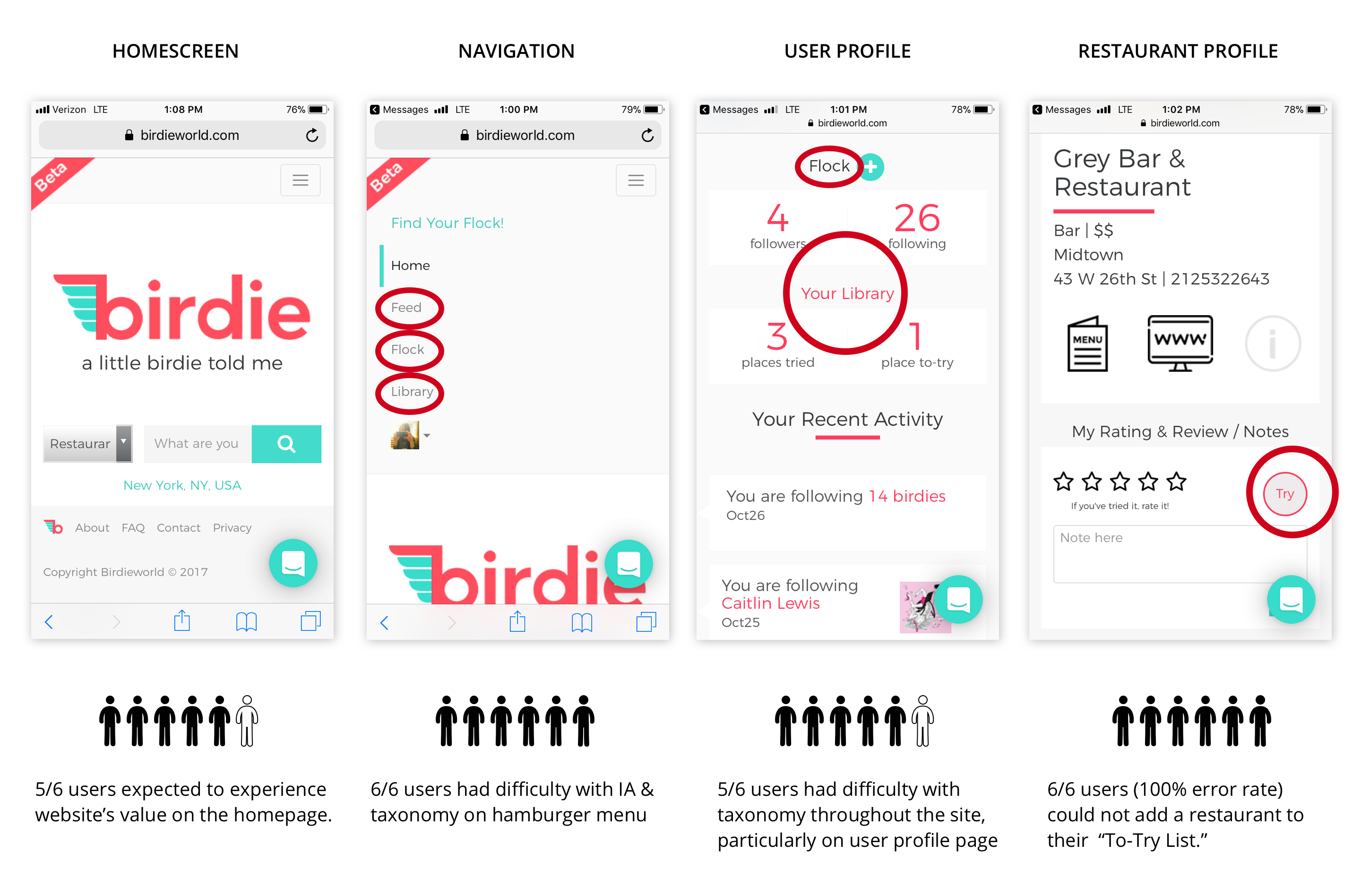
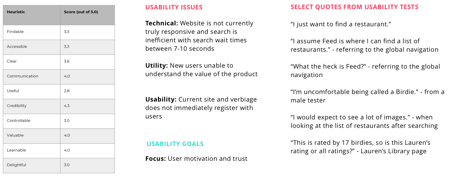
The heuristic analysis further indicated the site was not meeting basic usability standards. The Google Analytics cohort analysis showed a low retention rate— a finding that was not surprising given the usability concerns.
Know your competition
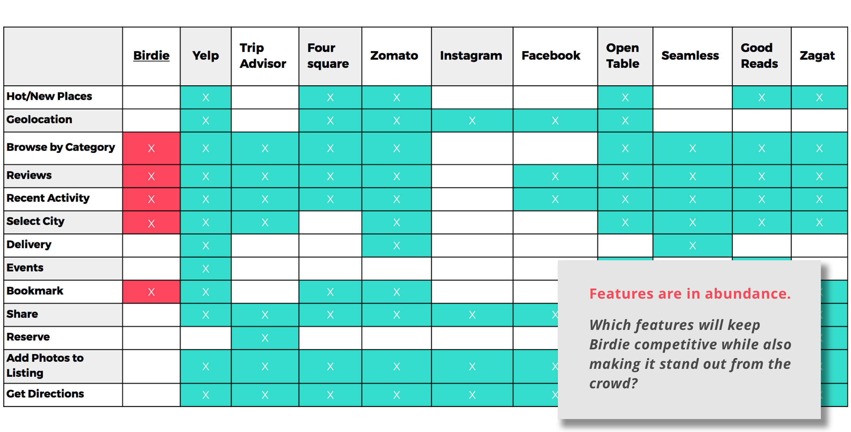
To understand the competitive landscape and ultimately unearth areas of opportunity, we examined an array of competitors — from start-ups like Salt, Rex, and Nomwell (RIP 10/24/17) to behemoths like Facebook, Instagram, and Foursquare.
Know the key players
To understand and contextualize prior design decisions and learn about project goals, we interviewed the main stakeholder, Birdie's CEO and founder, as well as three junior board members and the web developer. Being familiar with business goals, tech constraints and overall context brought us up to speed on the project and helped inform our design strategy. Through these interviews, we built a rapport with key players and ultimately strengthened trust between ourselves and our client.
Know your users
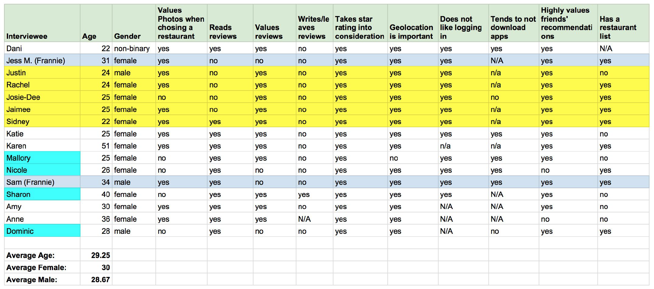
We interviewed 15 users who were selected from a pool of research and screener survey respondents. We were very particular about speaking to users who filled all of the target user criteria. We needed sturdy data to serve as the backbone of our new personas. Without solid research presented in a clear and convincing way, we risked not aligning with our client on the basic vision for the website.
Define
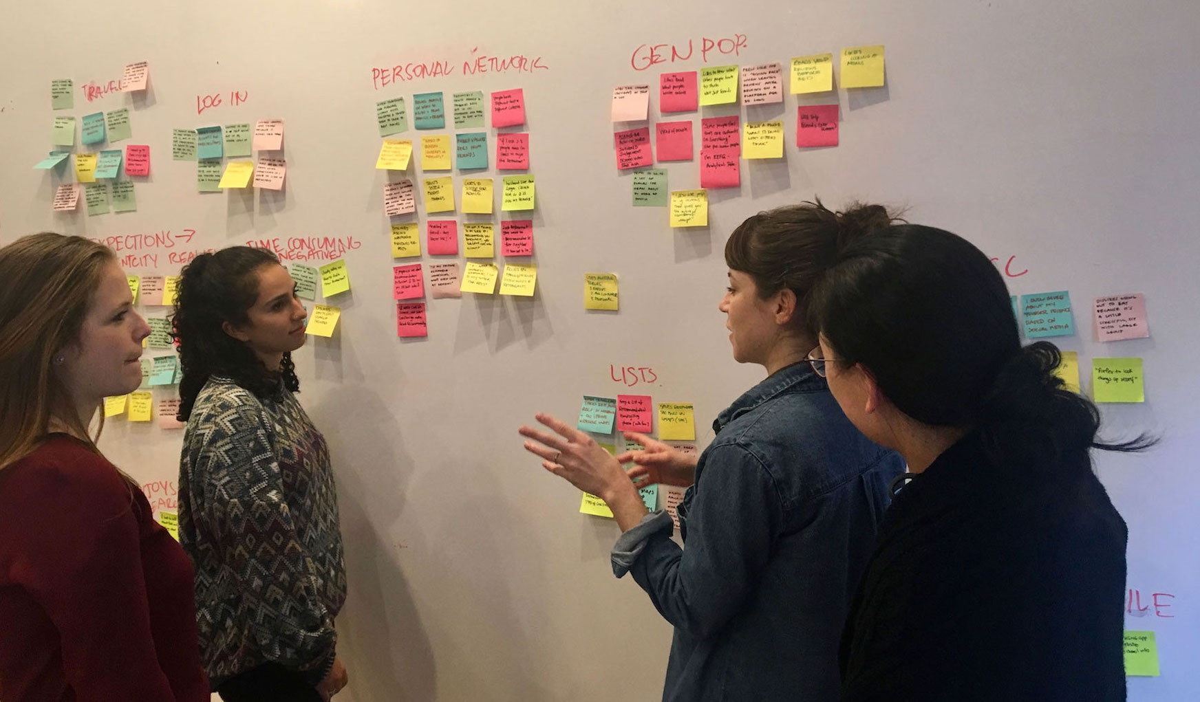
To transform the knowledge we amassed from our research into actionable insights, we stocked up on post-it notes and affinity mapped, a low-tech approach that excels at finding hidden associations and patterns from seemingly disconnected information. Affinity mapping unraveled the whys behind users’ needs.
From data to empathy
Two personas emerged from our findings, Jennifer and Matt. We deemed Jennifer our primary persona because she is an active Birdie user who regularly contributes and shares content. She is a Food Insider who likes to be in the know about new restaurants cropping up in her city. She is influencer who brings people to the platform. Matt, the Food Enthusiast, looks to the Food Insider for recommendations.
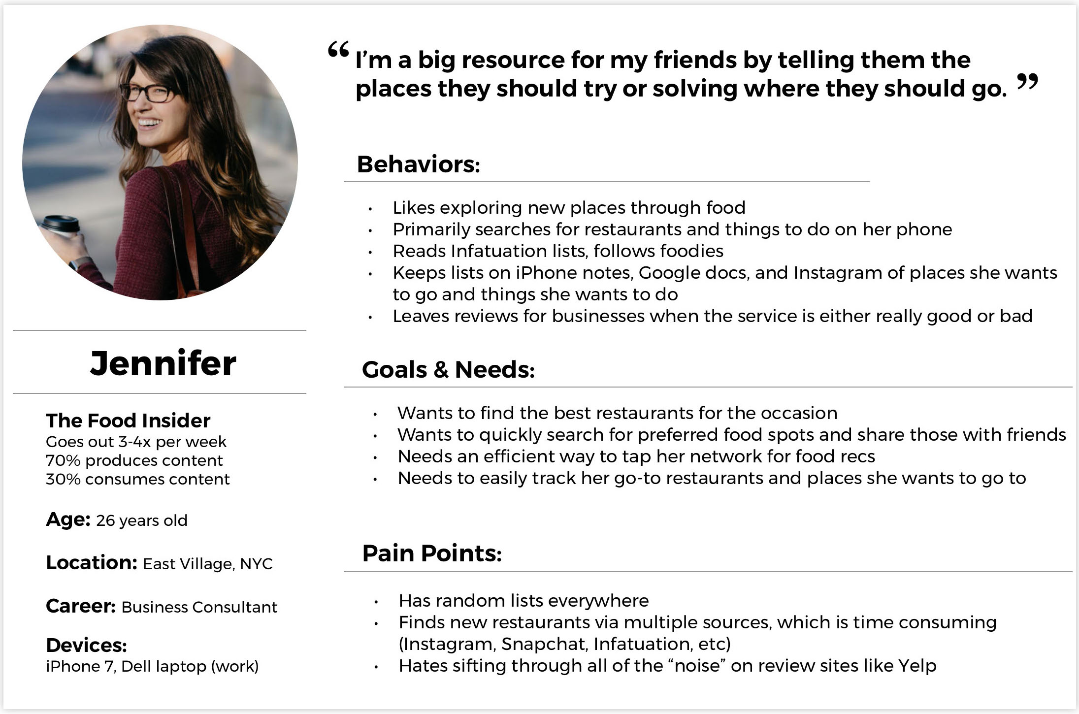
What would our primary persona do?
From this point on, Jennifer would in many ways lead our design process. We prioritized features according to her needs. In meetings with our client, we turned to Jennifer when explaining why we pursued one feature over another.
Reflecting on the problem
At this point in the design process, we took a step back to make sure we designing solutions for the right problem, and this refined problem statement emerged.
When choosing a restaurant, urban young professionals struggle to access their trusted network’s recommendations in order to find one that fits their needs. How might we provide a space where users can find relevant, trusted and valuable recommendations in a way that is engaging and efficient?
Ideate
With a more defined problem and user, we could start entertaining solutions. The MVP would address three main user needs: a way to find trusted restaurant recommendations, a way to track those recommendations, and a way to share those recommendations.
Design is a team sport
The ideation phase kicked off with several rounds of Design Studio, an open brainstorming session that rapidly externalizes ideas, generates new ideas and allows for creative exploration of problems. Ideas jumped from Sharpies to paper. Features were prioritized using the MoSCoW method.
Prototype. Test. Iterate.
Birdie’s homepage was a challenge. Users needed to recognize Birdie’s value from the get-go, something the site was not currently accomplishing. For the return user, the homepage offered a clunky search and nothing else. For the first-time visitor, the homepage only offered a sign-up option and nothing else.
 Our first two prototypes were in many ways textbook results of Lean UX, which assumes the initial product designs will be wrong. The team’s goal is to find out what they got wrong as soon as possible. And that we did! Prototype 3 succeeds in showing Birdie's unique value-- trusted recommendations from your friends are front and center with the "All Chirps by Friends" button.
User testing & validation
From Prototype 1 to the final mockup, we increased the Task Success Rate from 40% to 100%. The Birdie redesign succeeded in offering quality content up-front but also showed Birdie’s strength and utility throughout the user experience.
Future steps
The final iteration of Birdie, which included all of the features listed below in Phase 1, was met with great enthusiasm by our client. If users continue to validate these design solutions, additional features listed in Phase 2 and 3 can be tested, built and then launched.
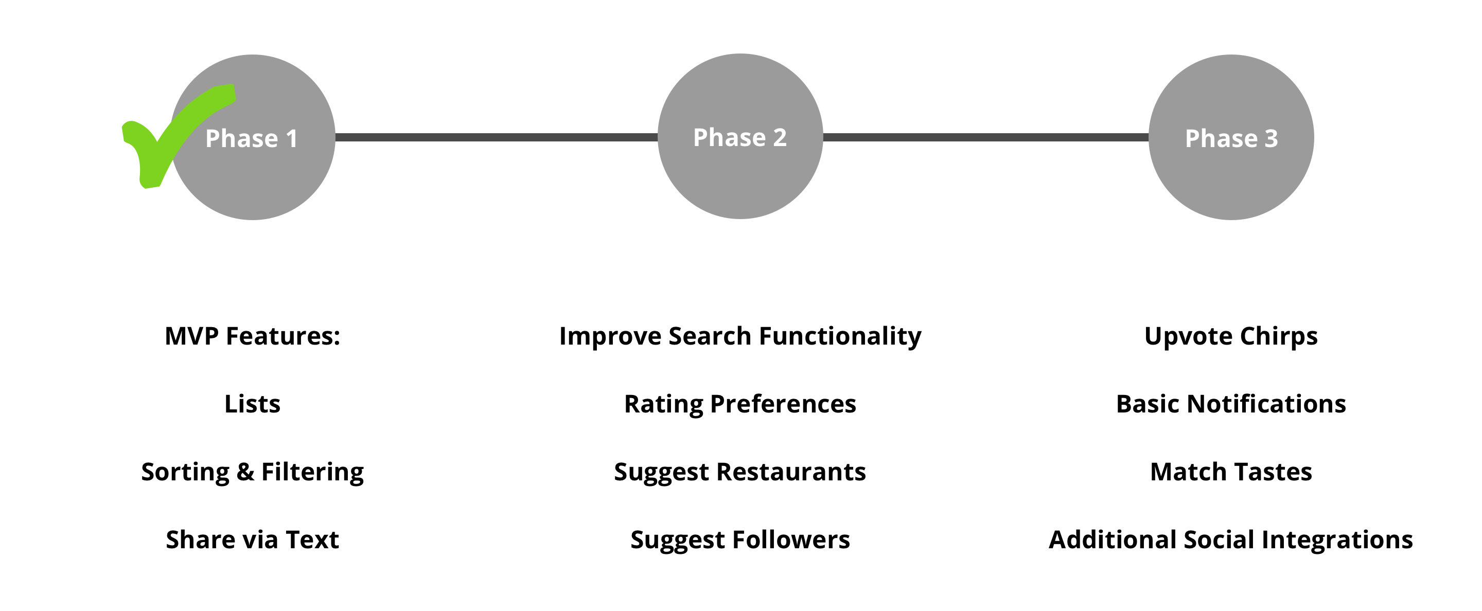
We hope to see the Birdie 2.0 built and shipped within the coming months. Finding areas of opportunity in a very crowded space was a daunting undertaking. We returned to the drawing board many times, but in the end our design solutions have the potential to make Birdie a stand-out tool to find great restaurants.
And finally, a very special thanks to my fantastic collaborators: Jaclyn Mann, Anneliese Klein, and Ellen Li. Creating successful products requires the skills, expertise and craft of many people. Watching Birdie grow and become greater than the sum of its parts was an incredible and rewarding experience.


